R Journey
R Journey
Introduction to data science with R
https://github.com/ssm123ssm/R-journey

Part 1 - Basics
R and RStudio
Why R?
R is an open-source programming language and software environment designed for statistical computing, data analysis, and data visualization. It provides a powerful toolset for working with data, performing complex calculations, and creating high-quality graphics.
- The R console is an interactive command-line interface that allows you to directly execute R commands and see the results immediately. It serves as a simple environment for writing and testing R code, as well as exploring data and experimenting with various functions and packages.
RStudio
RStudio is a popular integrated development environment (IDE) for R. It provides a user-friendly interface that combines the R console, a code editor, and various panels for managing files, viewing data, plotting graphics, and accessing help documentation. RStudio streamlines the workflow for developing, debugging, and sharing R code and analyses.
Installing packages
Packages are collections of R functions, data, and compiled code that provide additional tools and capabilities for specific tasks or domains. With thousands of packages available, you can easily enhance R’s capabilities to suit your analytical needs.
The currently loaded packages can be viewed using the sessionInfo() function.
Tidyverse
The tidyverse is a collection of R packages designed for data science that share a common philosophy, grammar, and data structures. It provides a consistent and intuitive approach to data manipulation, exploration, and visualization.
install.packages("tidyverse")
install.packages("dslabs")
RStudio workspace
R Objects
R Objects are the fundamental building blocks of the R language. They represent various data structures such as vectors, matrices, lists, and data frames, as well as functions and user-defined objects. R Objects store data, code, and results, allowing you to perform operations, calculations, and manipulations on them.
Case 1
y=β0+β1x21+β2x2
Given β0 is 2, β1 is 3 and β2 is 4, calculate the value of y, when x1 is 5 and x2 is 6
Functions
In R, functions are first-class objects, meaning they can be treated like any other data object. This allows functions to be assigned to variables, passed as arguments to other functions, and even returned as outputs from functions.
Case 2
seq function and vectors
The seq() function in R is used to generate a sequence of numbers. It allows you to create vectors of numbers within a specified range or following a specific pattern. The basic syntax is:
seq(from, to, by)
For example, seq(1, 10, by = 2) will create a sequence of odd numbers from 1 to 9: 1, 3, 5, 7, 9. The seq() function is versatile and can also generate sequences based on lengths or along specific vectors, making it a handy tool for creating numeric vectors in R.
Vectors
Vectors in R are fundamental data structures used to store collections of elements of the same data type. They can hold numeric, character, logical, or other types of data. Vectors can be created using the c() function, specifying elements separated by commas.
Loops
Loops in R are programming constructs used for iterating over a sequence of elements or performing repetitive tasks. The two main types of loops in R are for and while loops.
For loops: These loops execute a block of code a predetermined number of times, iterating over elements of a sequence. They are useful when the number of iterations is known in advance.
While loops: These loops continue iterating as long as a specified condition is true. They are suitable for situations where the number of iterations is not known beforehand.
A for loop in R consists of three main components: the loop variable, the sequence to iterate over, and the code block to execute for each iteration. The basic structure is as follows:
Find the sum of the first 100 numbers.
In R, there’s often more than one way to accomplish a task or solve a problem.
More interesting ways…
Using a function.
The formula for getting the sum of the first N integers is given by the arithmetic series formula:
sum=N×(N+1)2
Challenge
Get the sum of the numbers divisible by 3, up to one million.
Dataframes
Dataframes in R are essential data structures used for storing tabular data in a structured format, similar to a spreadsheet or database table.
They are two-dimensional objects consisting of rows and columns, where each column can contain data of different types, such as numeric, character, or factor.
Dataframes can be created using functions like data.frame() or by importing data from external sources like CSV files using functions such as read.csv() or read.table(). Once created, dataframes allow for easy manipulation, analysis, and visualization of data using a wide range of built-in functions and packages.
Loading dataframes
The data() function in R is used to load built-in datasets that come packaged with R or any installed packages. These datasets are often used for demonstration purposes or for practicing data analysis techniques.
Common functions used on dataframes
The str() function in R is used to display the internal structure of an R object. It provides a compact representation of the object’s data type, dimensions (if applicable), and a glimpse of its contents.
'data.frame':   51 obs. of  5 variables:
 $ state     : chr  "Alabama" "Alaska" "Arizona" "Arkansas" ...
 $ abb       : chr  "AL" "AK" "AZ" "AR" ...
 $ region    : Factor w/ 4 levels "Northeast","South",..: 2 4 4 2 4 4 1 2 2 2 ...
 $ population: num  4779736 710231 6392017 2915918 37253956 ...
 $ total     : num  135 19 232 93 1257 ...
Creating dataframes
Dataframes can be created in R using the data.frame() function, which allows you to combine vectors of different types into a structured tabular format. You can specify column names and assign values to each column using the data.frame() function.
Other commonly used dplyr functions
Here are some commonly used functions from the dplyr package in R:
select(): Subset columns from a data frame.filter(): Subset rows based on conditions.mutate(): Add new columns or modify existing ones.summarise(): Compute summary statistics.group_by(): Group data by one or more variables.left_join(),right_join(), etc.: Combine data frames by matching rows.
Part 2 - Data Visualization
Exploratory Data Analysis (EDA)
Exploratory Data Analysis (EDA) is a crucial step in the data analysis process that involves examining and summarizing the main characteristics of a dataset.
It helps to gain insights, detect patterns, and identify potential issues or outliers in the data before proceeding with further analysis or modeling. EDA is an iterative process that typically involves visualizations and statistical summaries.
Motivation
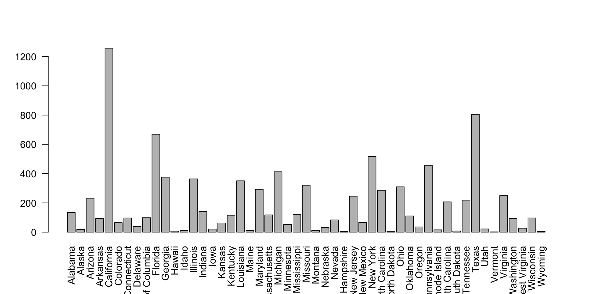
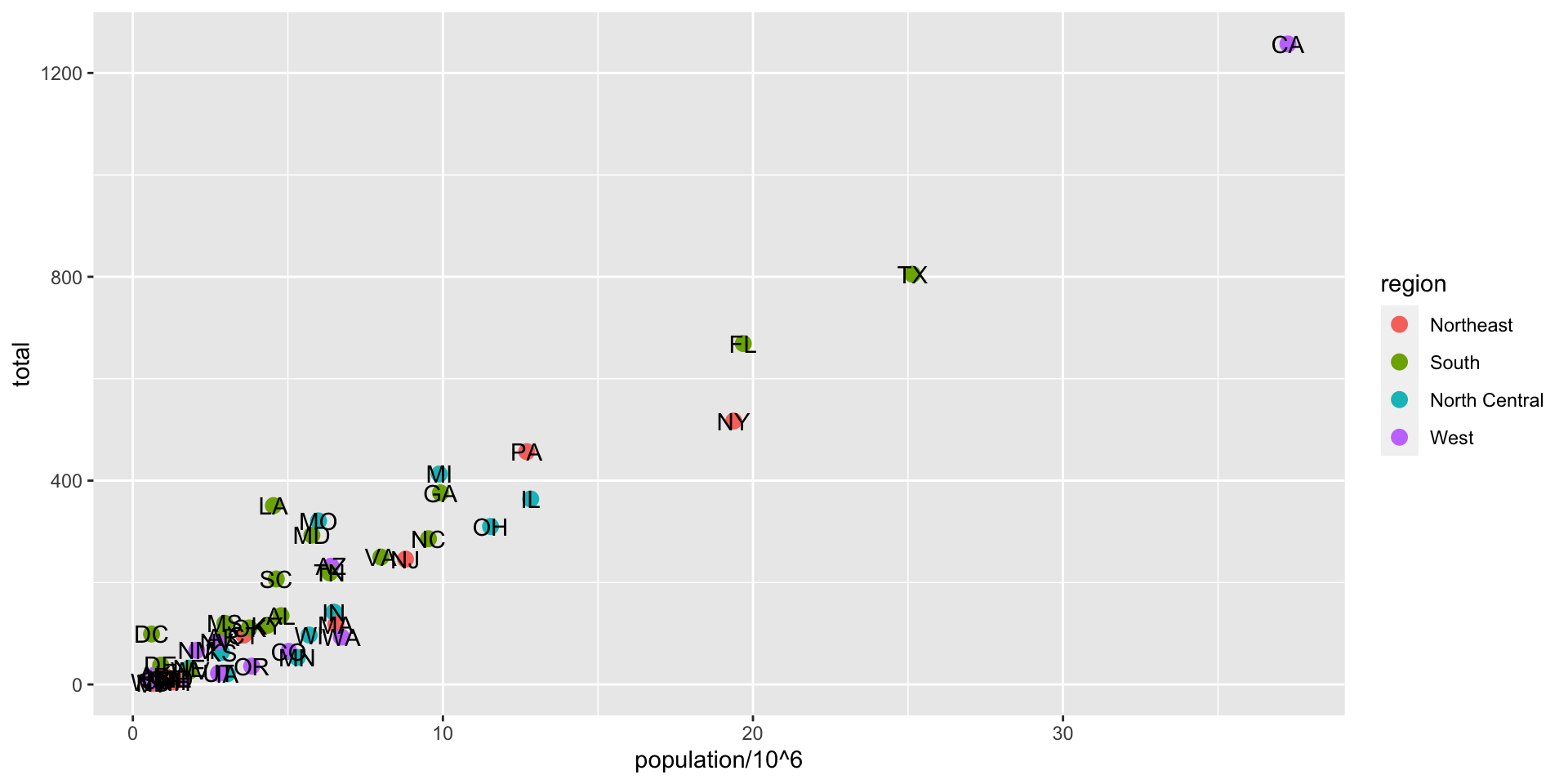
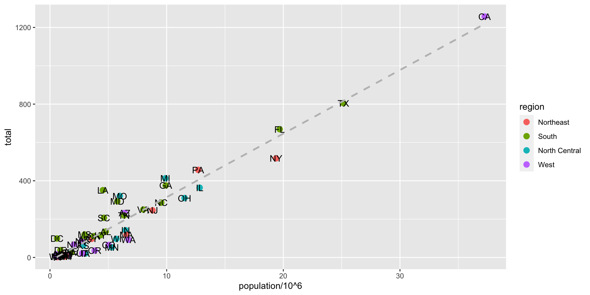
The murders dataset contains statistics on population, murder rates, and other socio-economic factors for different states in the United States.
What are the factors associated with murder rates?
The pipe Operator
The pipe operator (%>%) is a convenient way to express a sequence of operations in a more readable format.
Instead of nesting functions inside one another, the pipe operator takes the output from one function and passes it as the first argument to the next function.
library(dplyr)
library(dslabs)
data(murders)

murders %>%
  arrange(desc(total)) %>%
  mutate(rate_per_million = total / population * 1e6) %>%
  select(state, rate_per_million)  %>%
  head()
state rate_per_million
1 California 33.74138
2 Texas 32.01360
3 Florida 33.98069
4 New York 26.67960
5 Pennsylvania 35.97751
6 Michigan 41.78622While R has powerful data visualization packages like ggplot2, it also comes with several built-in functions for creating basic graphs.
These functions can be useful for quick visualizations or when you don’t need the advanced features of specialized packages.
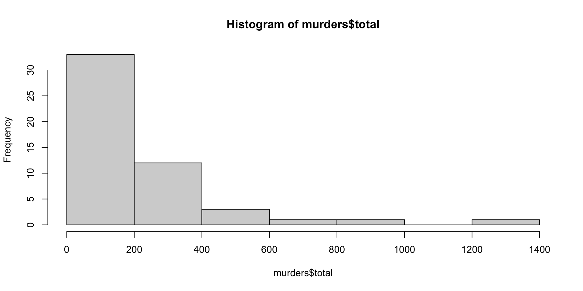
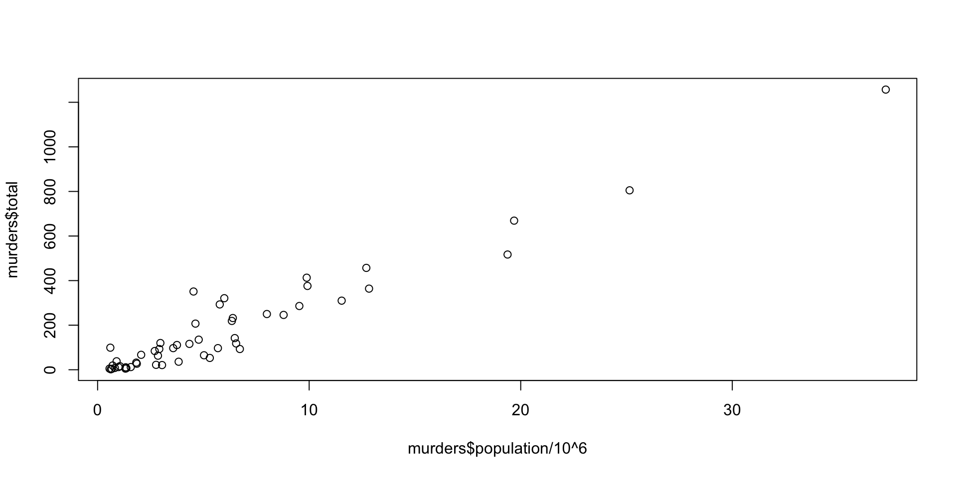
hist(): Create a histogram.plot(): Create a scatter plot.barplot(): Create a bar plot.boxplot(): Create a box plot.pie(): Create a pie chart.
ggplot2 Package
The ggplot2 package is one of the most popular and powerful data visualization packages in R.
It is based on the principles of the Grammar of Graphics, which provides a flexible and consistent framework for creating a wide range of statistical graphics.
With ggplot2, you can create highly customizable and publication-quality plots using a layered approach.
There are three main components to a ggplot2 plot:
- Data: The dataset to be visualized.
- Aesthetic mappings: The relationship between variables and visual properties.
- Geometric objects (geoms): The visual elements that represent the data, such as points, lines, or bars.
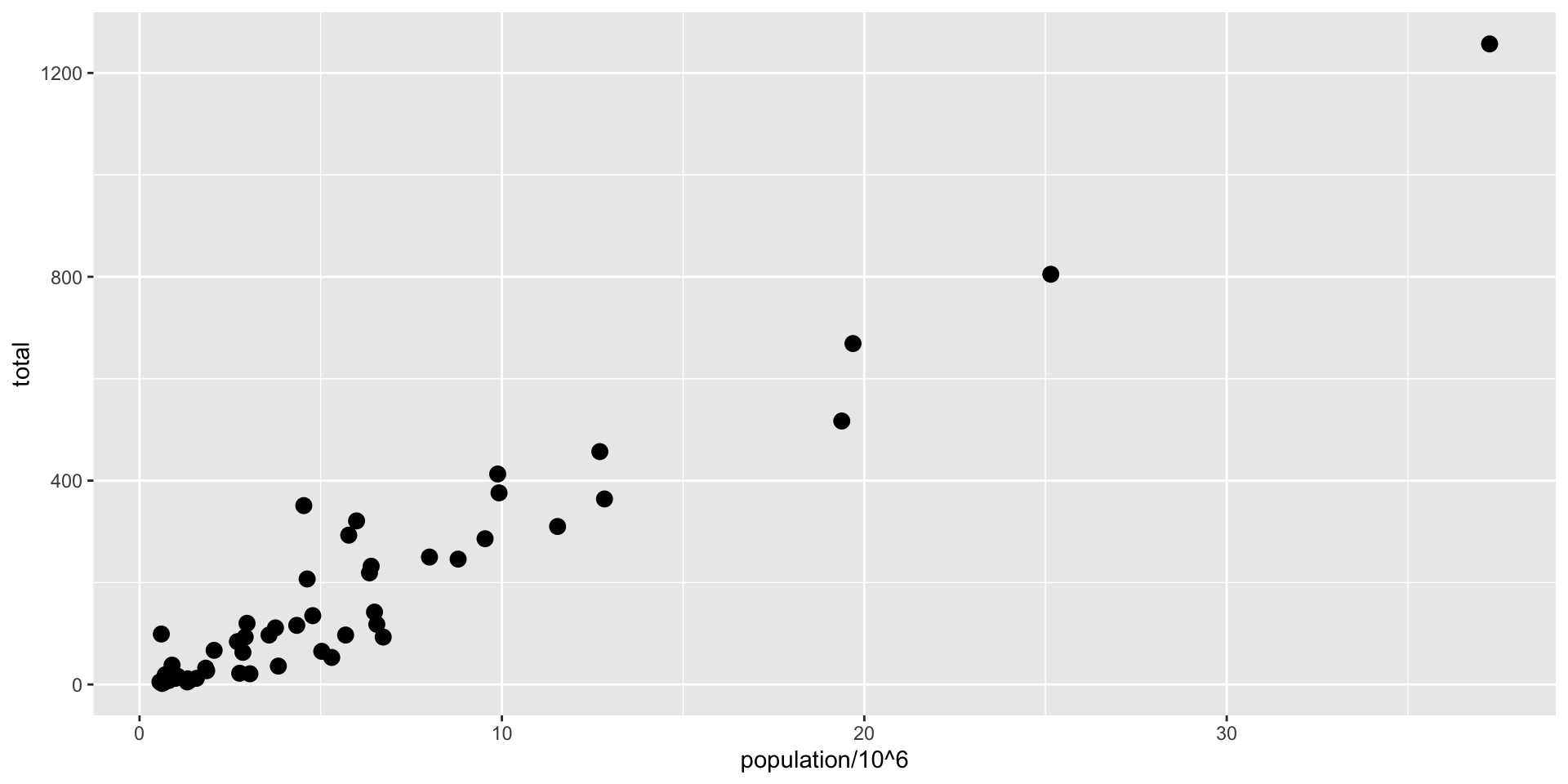
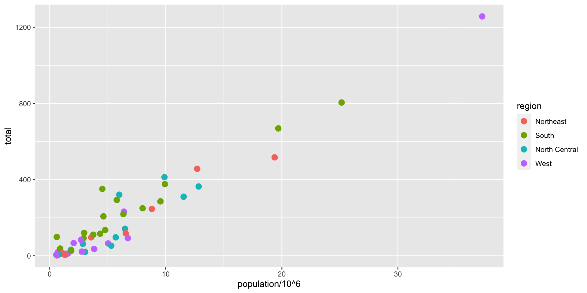
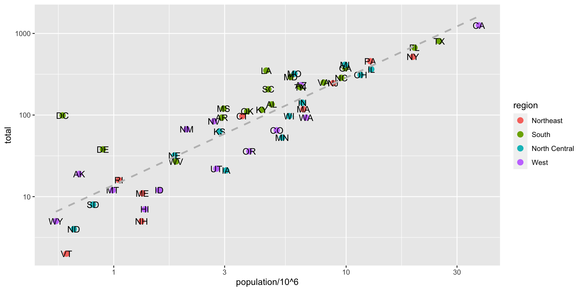
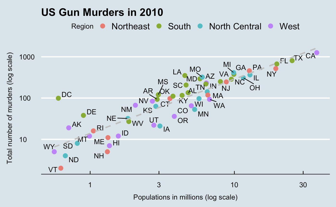
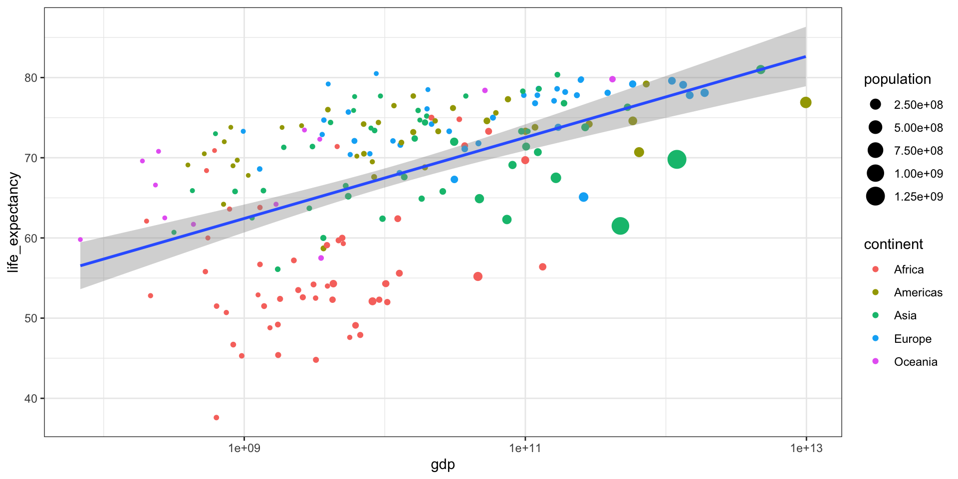
ggplot(data = murders, aes(x = population/10^6, y = total)) +
geom_point(size = 3, aes(col = region)) +
geom_text(aes(label = abb)) +
geom_smooth(method = "lm", se = FALSE, linewidth = 1, col = 'grey', linetype = 2)+
scale_x_log10() +
scale_y_log10() +
xlab("Populations in millions (log scale)") +
ylab("Total number of murders (log scale)") +
ggtitle("US Gun Murders in 2010")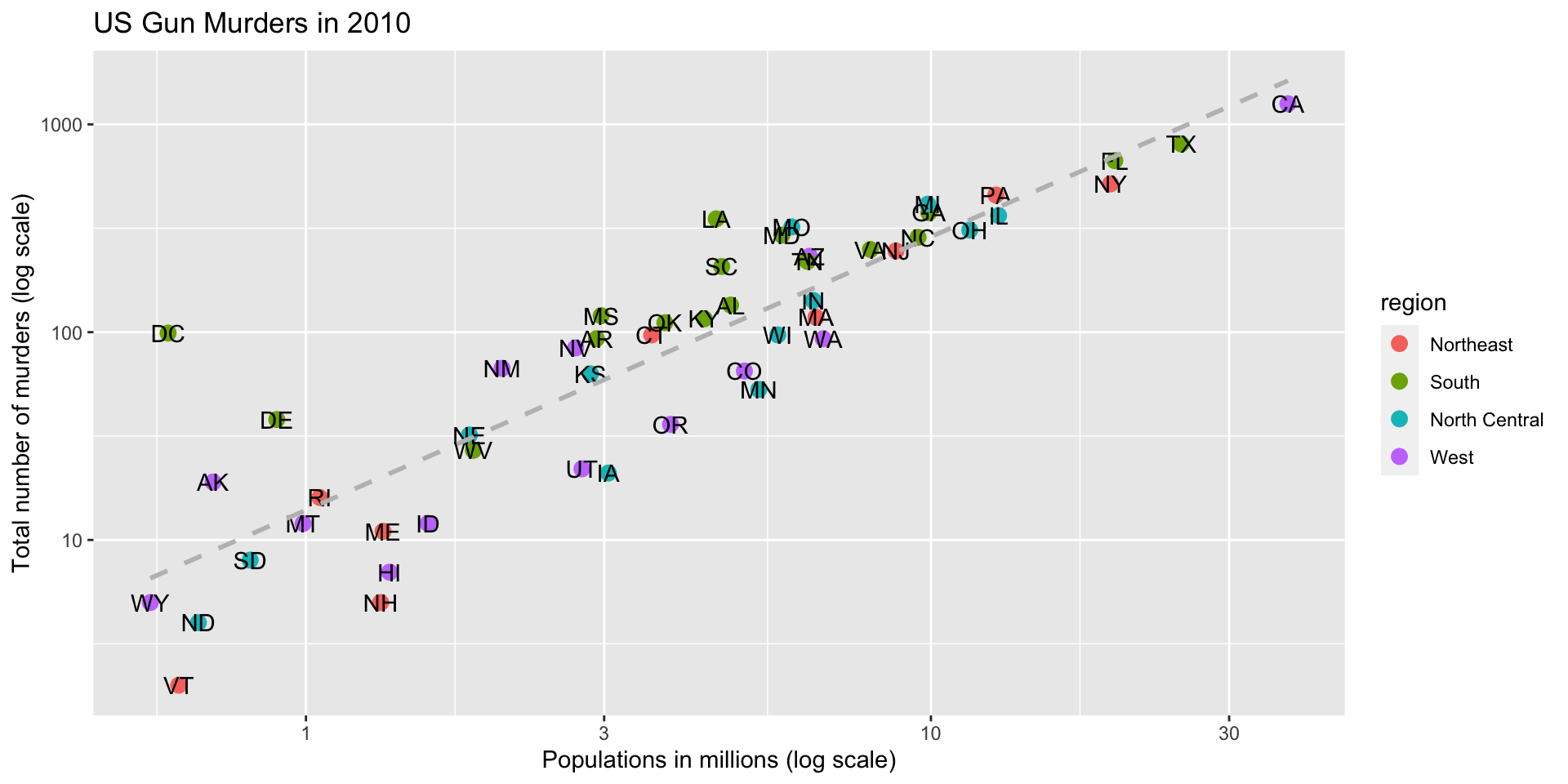
ggplot(data = murders, aes(x = population/10^6, y = total)) +
  geom_point(size = 3, aes(col = region)) +
  geom_text_repel(aes(label = abb)) +
  geom_smooth(method = "lm", se = FALSE, linewidth = 1, col = 'grey', linetype = 2)+
  scale_x_log10() +
  scale_y_log10() +
  xlab("Populations in millions (log scale)") +
  ylab("Total number of murders (log scale)") +
ggtitle("US Gun Murders in 2010") 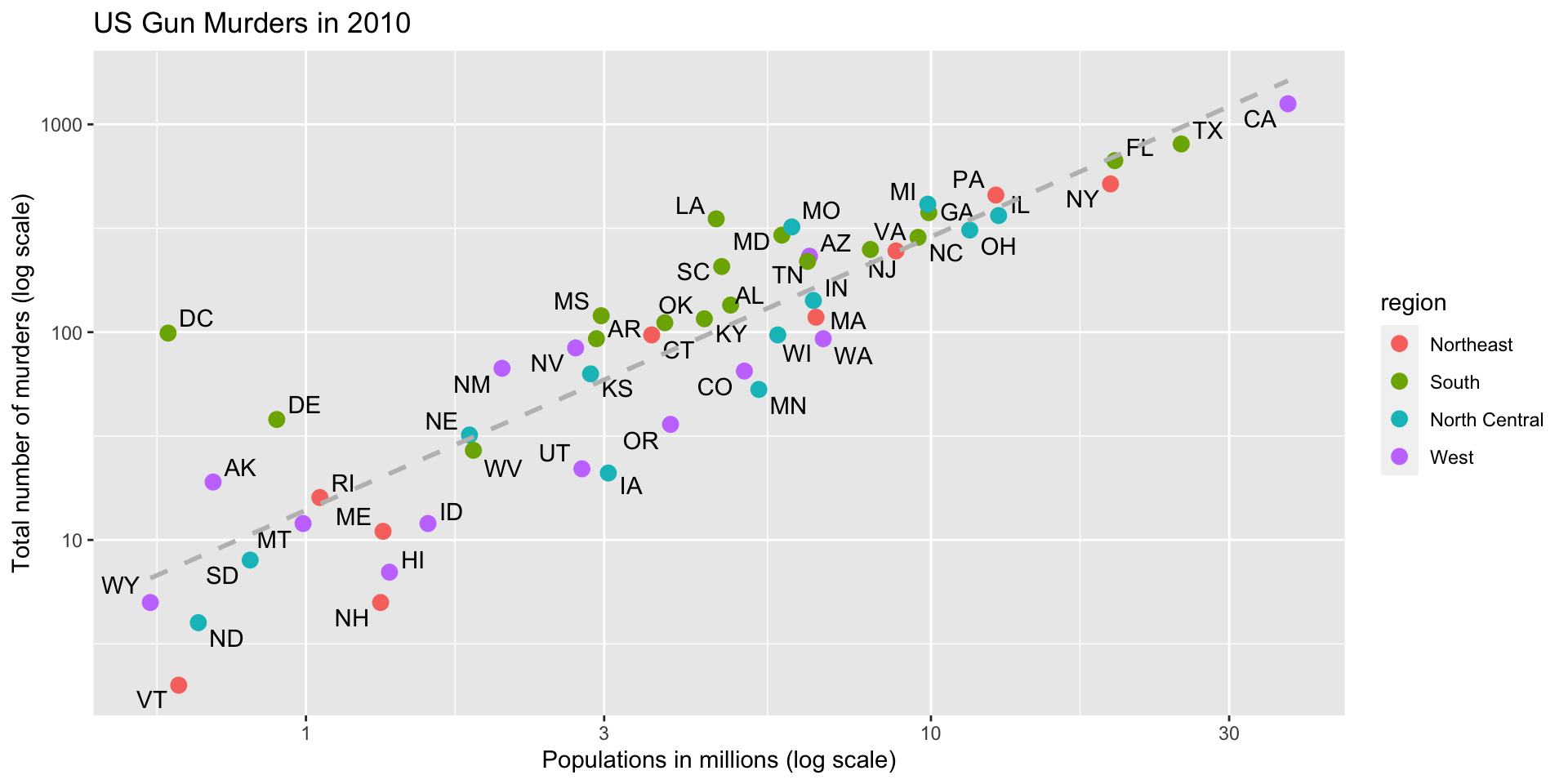
p <- ggplot(data = murders, aes(x = population/10^6, y = total)) +
  geom_point(size = 3, aes(col = region)) +
  geom_text_repel(aes(label = abb)) +
  geom_smooth(method = "lm", se = FALSE, linewidth = 1, col = 'grey', linetype = 2)+
  scale_x_log10() +
  scale_y_log10() +
  xlab("Populations in millions (log scale)") +
  ylab("Total number of murders (log scale)") +
  ggtitle("US Gun Murders in 2010") +
  theme_economist()
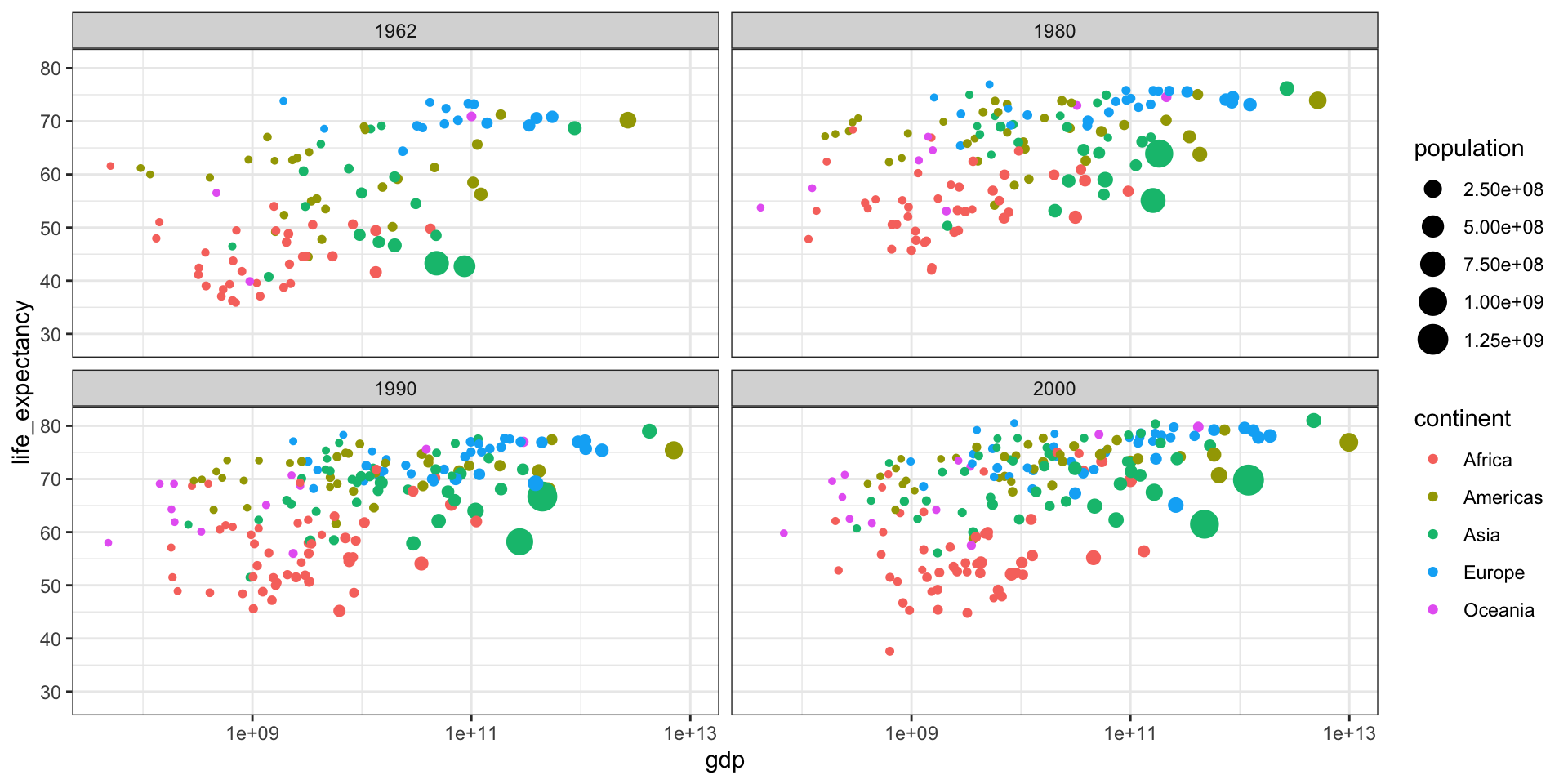
Gapminder
Gapminder was founded on the realization that many widespread perceptions and beliefs about global development were simply not accurate or based on outdated information. Hans Rosling frequently referred to these as “devastating misconceptions.”
You are probably wrong about it!
Two Worlds
The “Two World View” is one of the major myths or misconceptions that Gapminder has sought to dispel through its work on data visualization and global development analysis.
The Two World View refers to the oversimplified perception that the world is divided into two distinct groups:
- The wealthy Western nations/first world (U.S., Western Europe, etc.)
- The poor developing nations/third world (Africa, Asia, Latin America, etc.)
People in the “Third World” had very low life expectancies, while those in the “First World” lived much longer lives.
High fertility rates causing overpopulation was primarily a problem in poor, developing countries.
Again, you are probably wrong about it!
Lets visualize life expectancy and fertility rate of countries in 1962.
library(tidyverse)
library(gapminder)
library(ggplot2)
theme_set(theme_bw())
library(gt)
gapminder <- dslabs::gapminder

#create head of the data with gt
gt(gapminder %>% head())| country | year | infant_mortality | life_expectancy | fertility | population | gdp | continent | region |
|---|---|---|---|---|---|---|---|---|
| Albania | 1960 | 115.40 | 62.87 | 6.19 | 1636054 | NA | Europe | Southern Europe |
| Algeria | 1960 | 148.20 | 47.50 | 7.65 | 11124892 | 13828152297 | Africa | Northern Africa |
| Angola | 1960 | 208.00 | 35.98 | 7.32 | 5270844 | NA | Africa | Middle Africa |
| Antigua and Barbuda | 1960 | NA | 62.97 | 4.43 | 54681 | NA | Americas | Caribbean |
| Argentina | 1960 | 59.87 | 65.39 | 3.11 | 20619075 | 108322326649 | Americas | South America |
| Armenia | 1960 | NA | 66.86 | 4.55 | 1867396 | NA | Asia | Western Asia |
Is it the same in 2012?
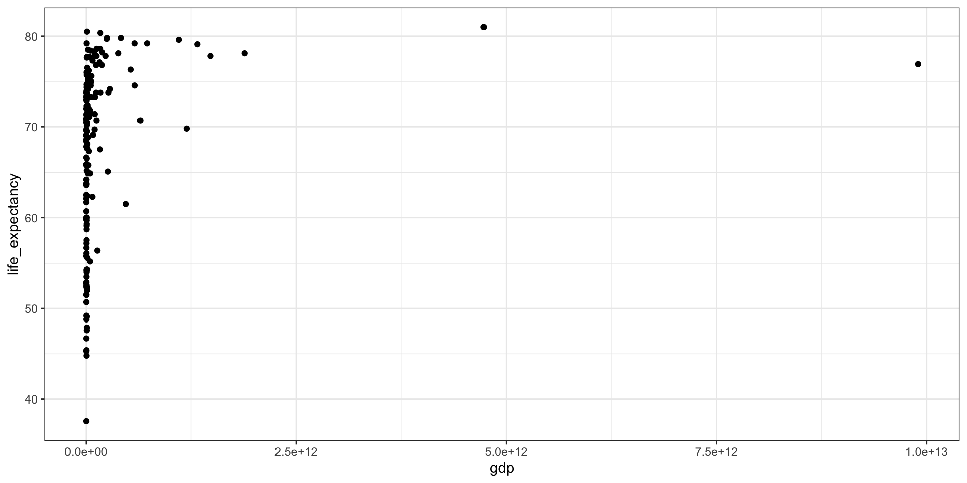
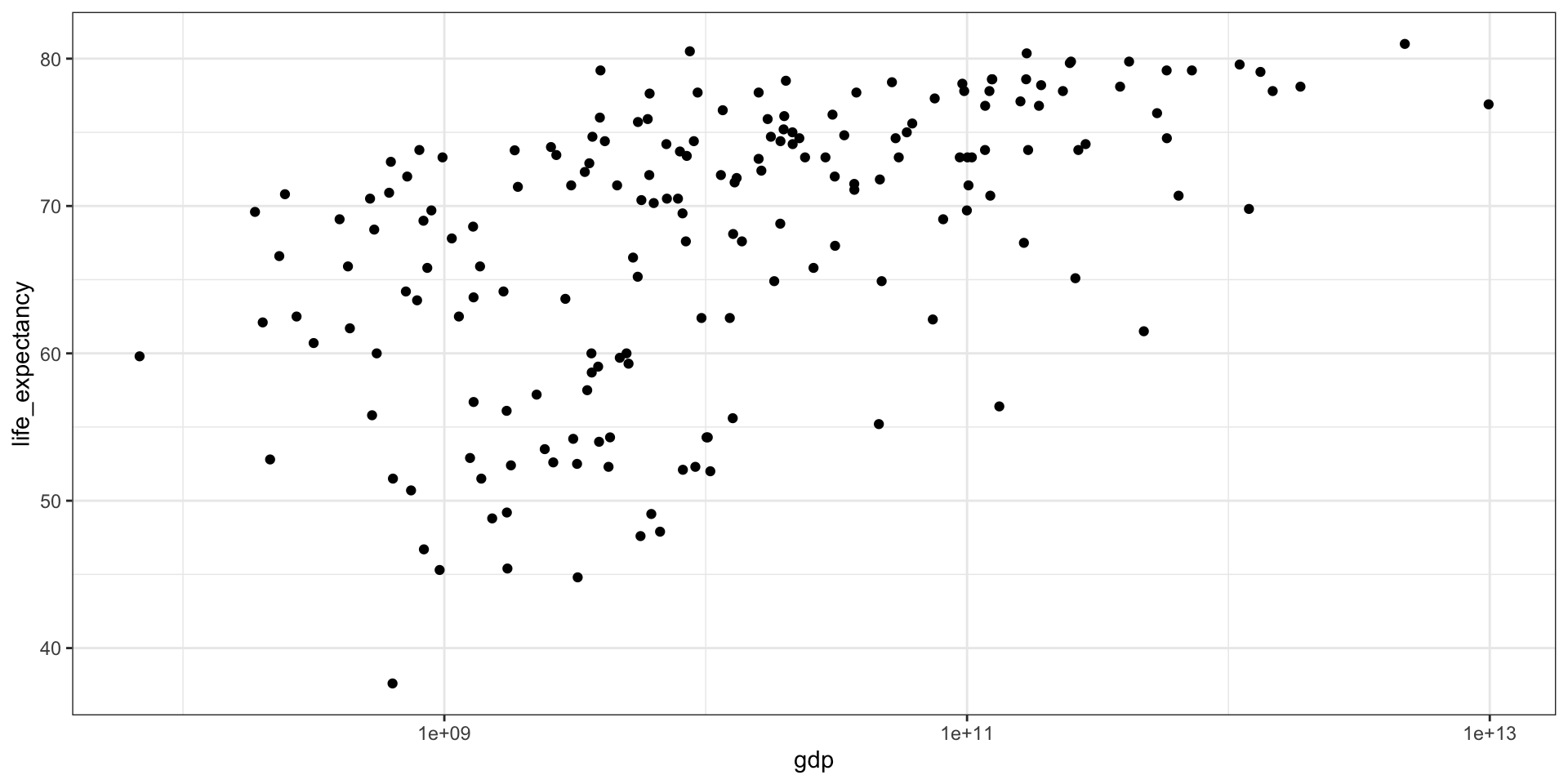
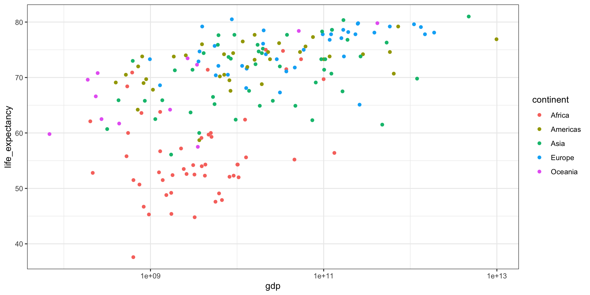
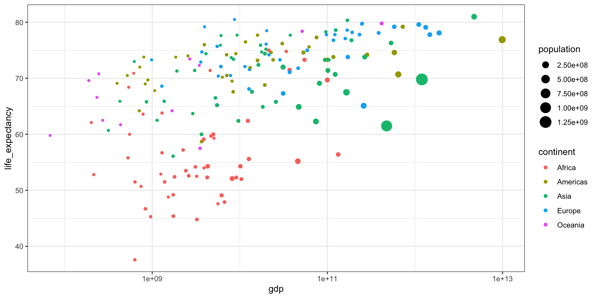
GDP vs Life Expectancy
What is the relationship between GDP and life expectancy across countries and over time?
| country | year | infant_mortality | life_expectancy | fertility | population | gdp | continent | region |
|---|---|---|---|---|---|---|---|---|
| Albania | 2000 | 23.2 | 74.70 | 2.38 | 3121965 | 3686649387 | Europe | Southern Europe |
| Algeria | 2000 | 33.9 | 73.30 | 2.51 | 31183658 | 54790058957 | Africa | Northern Africa |
| Angola | 2000 | 128.3 | 52.30 | 6.84 | 15058638 | 9129180361 | Africa | Middle Africa |
| Antigua and Barbuda | 2000 | 13.8 | 73.80 | 2.32 | 77648 | 802526701 | Americas | Caribbean |
| Argentina | 2000 | 18.0 | 74.20 | 2.48 | 37057453 | 284203745280 | Americas | South America |
| Armenia | 2000 | 26.6 | 71.30 | 1.30 | 3076098 | 1911563665 | Asia | Western Asia |
| Aruba | 2000 | NA | 73.78 | 1.87 | 90858 | 1858659293 | Americas | Caribbean |
| Australia | 2000 | 5.1 | 79.80 | 1.76 | 19107251 | 416887521196 | Oceania | Australia and New Zealand |
| Austria | 2000 | 4.6 | 78.20 | 1.37 | 8050884 | 192070749954 | Europe | Western Europe |
| Azerbaijan | 2000 | 60.6 | 66.50 | 2.05 | 8117742 | 5272617196 | Asia | Western Asia |

Part 3 - Statistics
Summary Statistics
Distribution is one of the most important concepts in statistics. It is a function that shows the possible values for a variable and how often they occur.
For example, with categorical data, the distribution simply describes the proportion of each unique category.
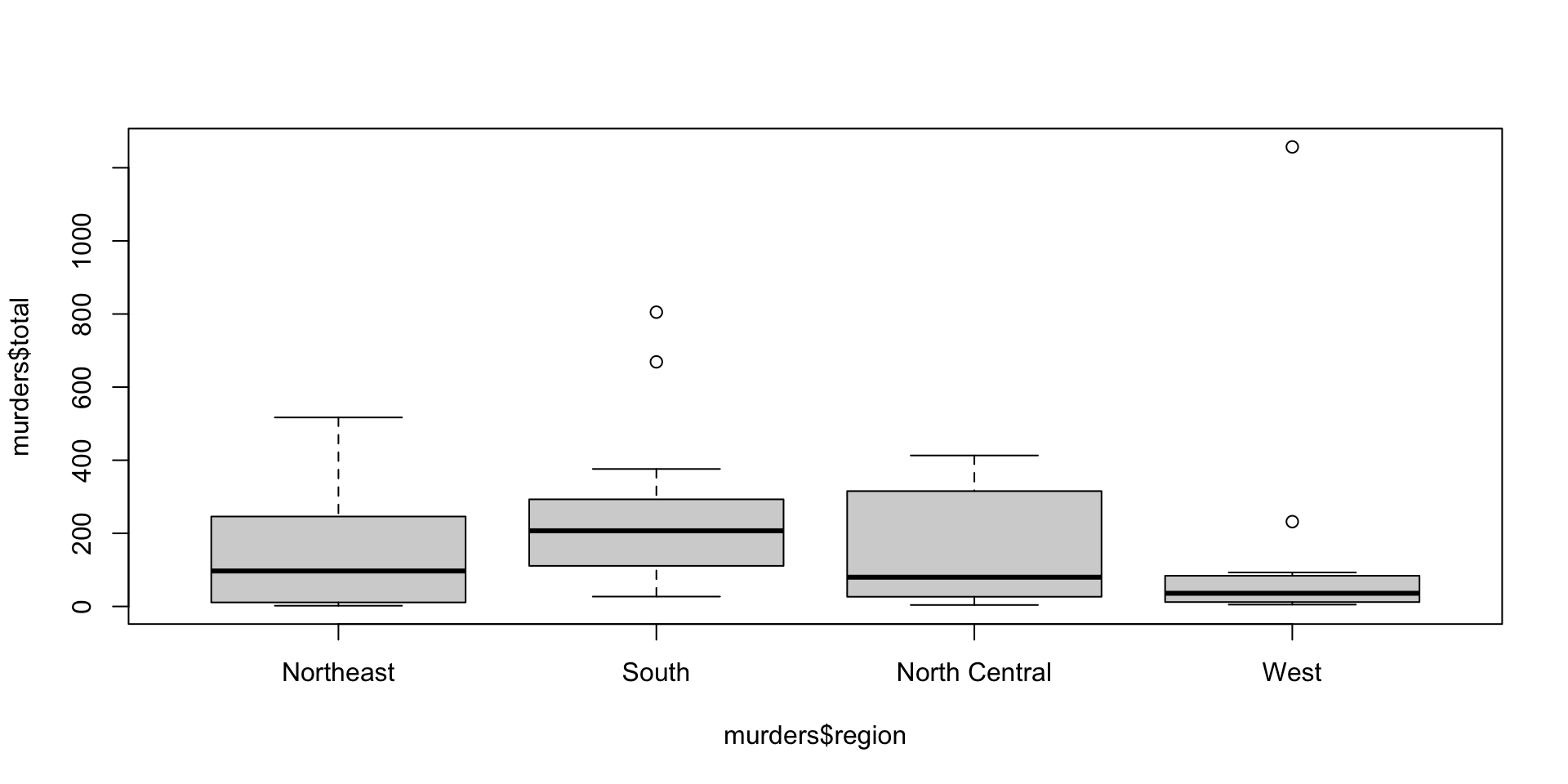
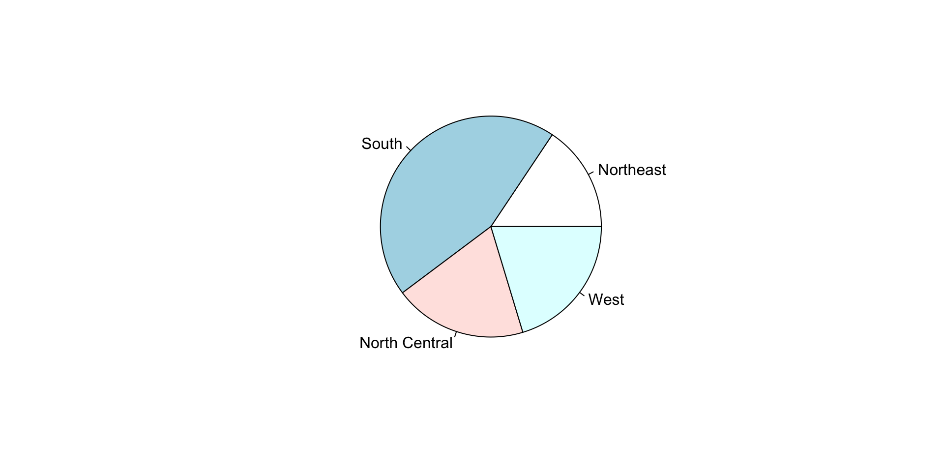
Describe the distribution of the states.region dataset.
state.region
    Northeast         South North Central          West
            9            16            12            13
state.region
Northeast South North Central West
0.18 0.32 0.24 0.26 Describing continuous data
Case study: Heights dataset
Similar to what the frequency table does for categorical data, the eCDF defines the distribution for numerical data.
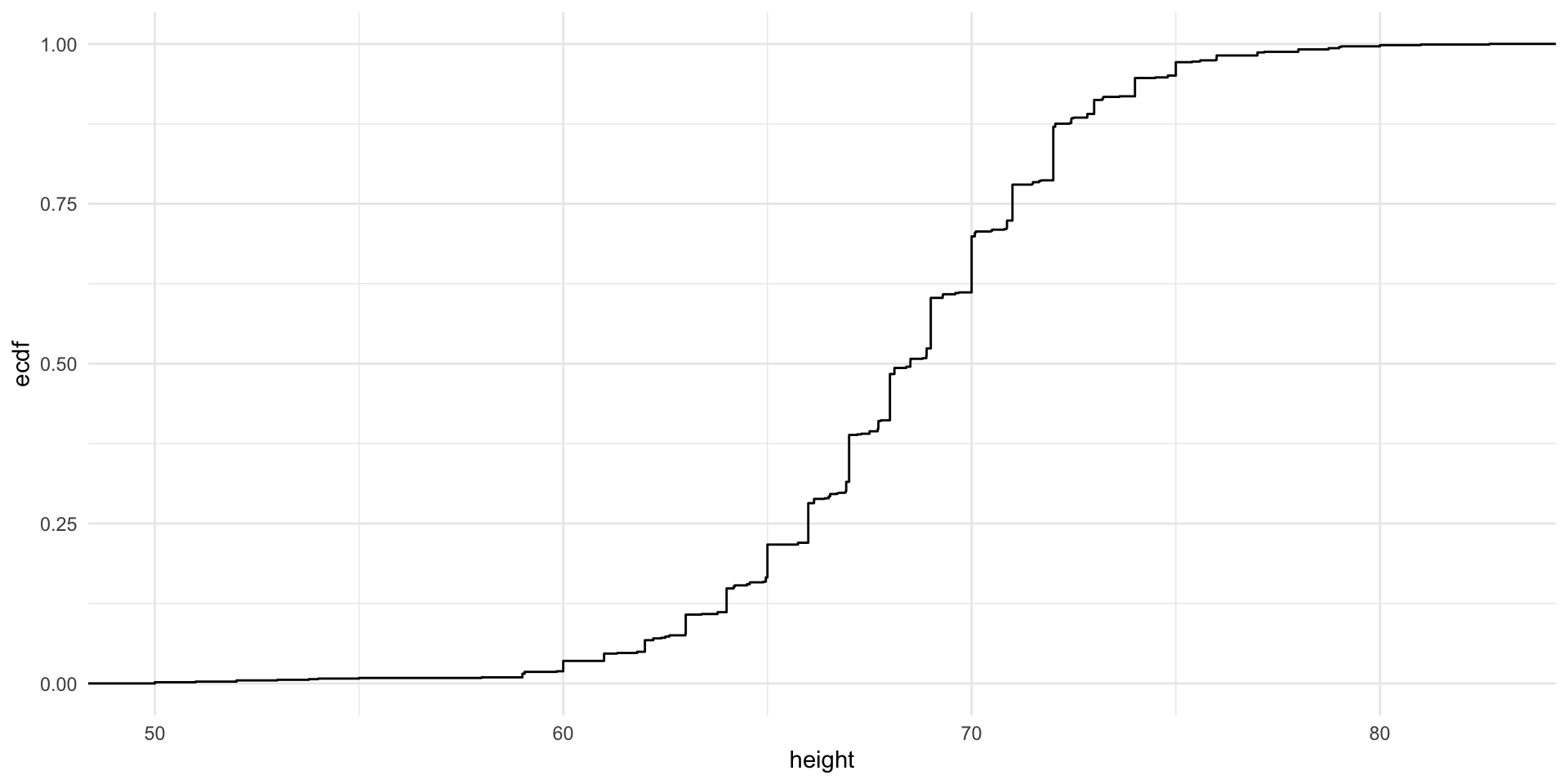
F(a)=Proportion of data points that are less than or equal to a
Histograms and Smoothed Density Plots
Although the eCDF concept is widely discussed in statistics textbooks, it is not very popular in practice. It is difficult to see if the distribution is symmetric, what ranges contains 95% of the values. Histograms are much preferred because they greatly facilitate answering such questions.
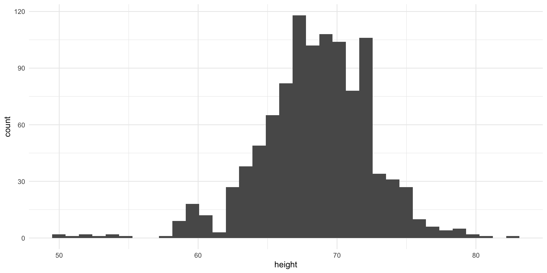
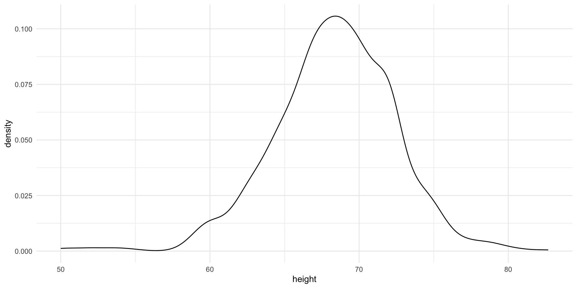
In this plot, we no longer have sharp edges at the interval boundaries and many of the local peaks have been removed. Also, the scale of the y-axis changed from counts to density.
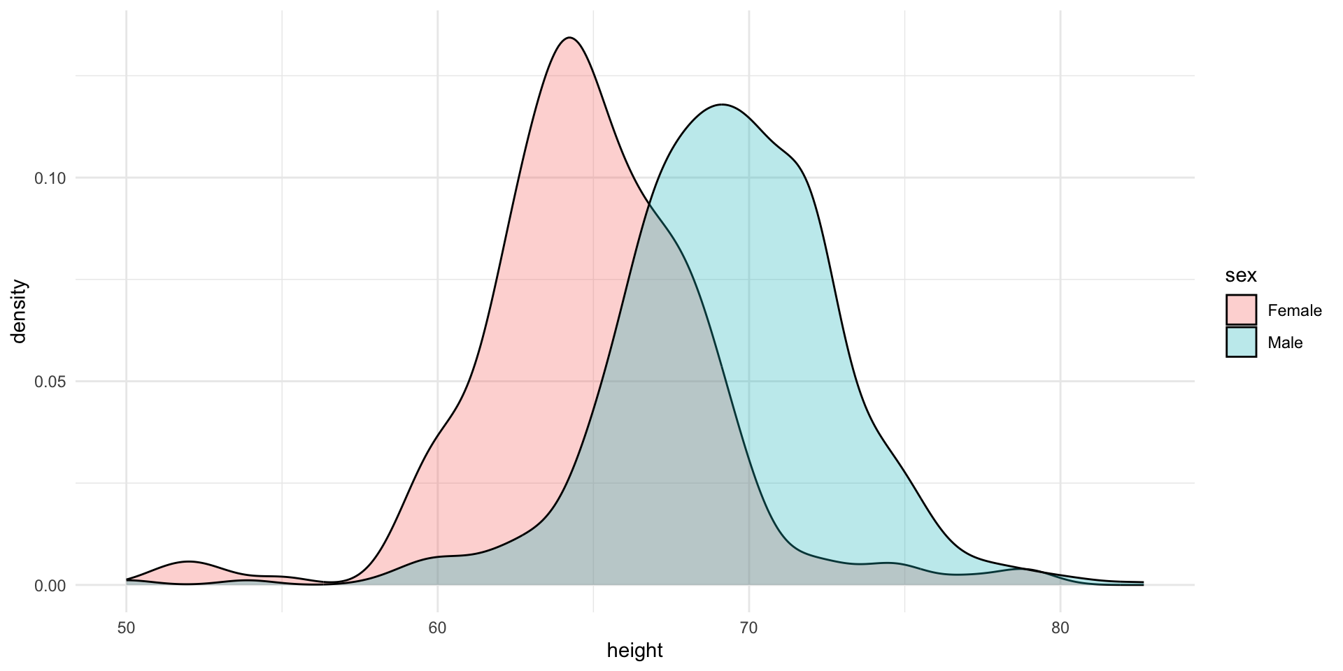
Stratified plots
Lets try to stratify the data by sex and see how the distribution changes.
The challenge is to contruct this plot using ggplot2.
Normal Distribution
What percentage of the data is within 1 standard deviation of the mean?
Lets simulate a normal distribution with mean 0 and standard deviation 1.
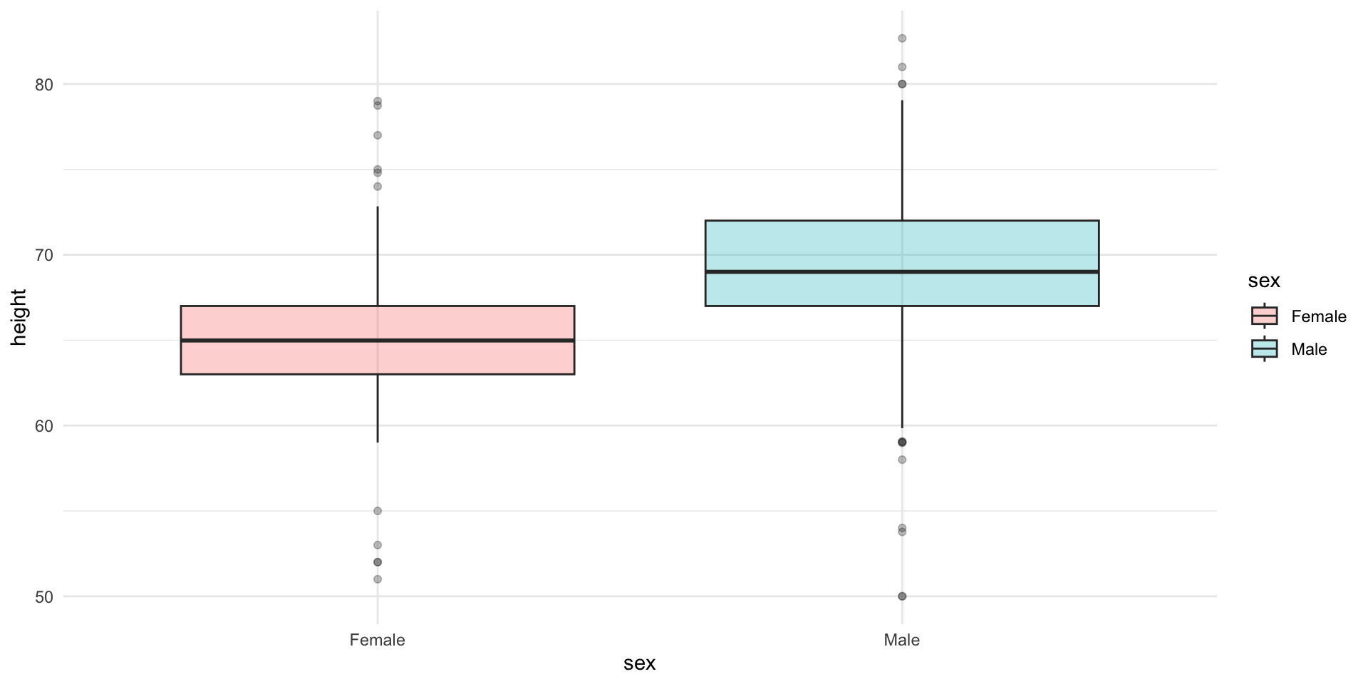
Stratified boxplots
Try to construct this plot using ggplot2.
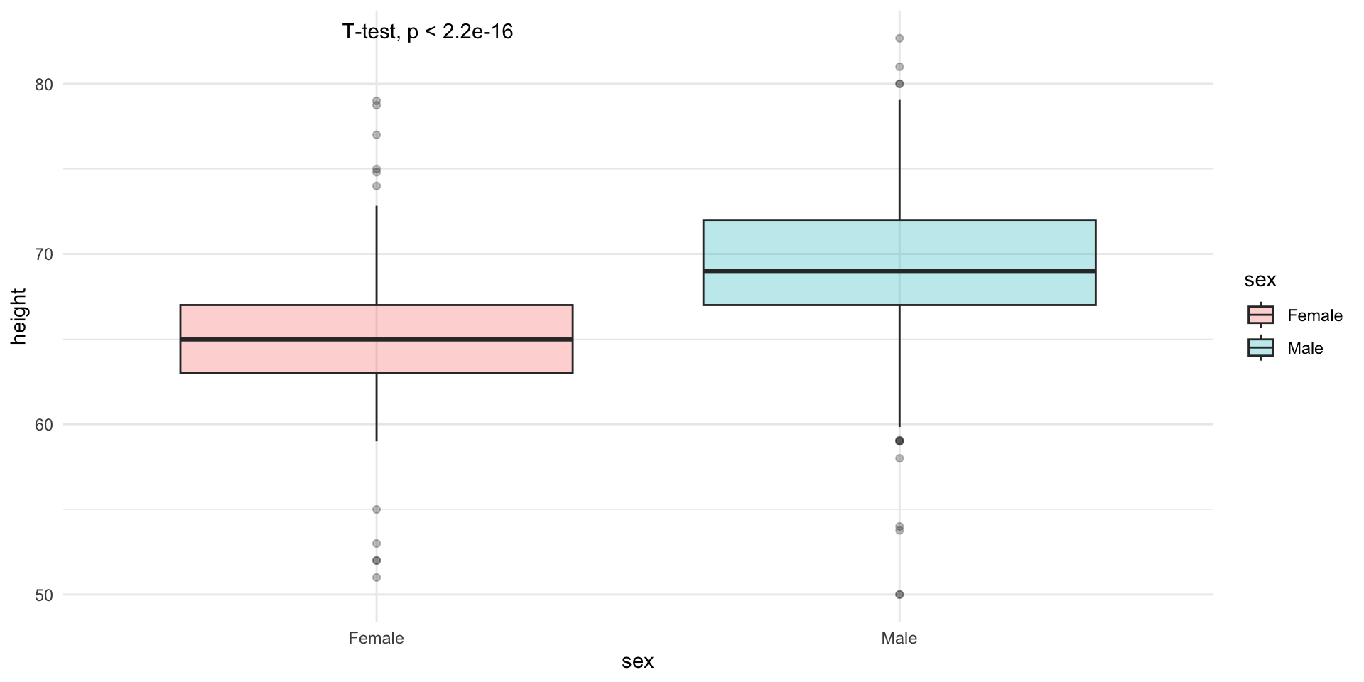
Comparing means
Lets compare the means of the two groups using a t-test.
    Welch Two Sample t-test

data:  height by sex
t = -15.925, df = 374.41, p-value < 2.2e-16
alternative hypothesis: true difference in means between group Female and group Male is not equal to 0
95 percent confidence interval:
 -4.915553 -3.835108
sample estimates:
mean in group Female   mean in group Male
            64.93942             69.31475
    Welch Two Sample t-test

data:  heights$height[heights$sex == "Female"] and heights$height[heights$sex == "Male"]
t = -15.925, df = 374.41, p-value < 2.2e-16
alternative hypothesis: true difference in means is not equal to 0
95 percent confidence interval:
 -4.915553 -3.835108
sample estimates:
mean of x mean of y
64.93942 69.31475 We can calculate the test statistic and print the p-value on the plot, using ggpubr package.
Some common functions available in stats package
| Function | Description |
|---|---|
mean(), median(), sd() |
Calculate mean, median, and standard deviation |
t.test(), wilcox.test(), var.test() |
Hypothesis tests (t-test, Wilcoxon test, variance test) |
cor() |
Calculate correlations between variables |
dnorm(), pnorm(), qnorm() |
Density, distribution, and quantile functions for the normal distribution |
dpois(), ppois(), qpois() |
Similar functions for the Poisson distribution |
dbinom(), pbinom(), qbinom() |
Functions for the binomial distribution |
lm() |
Fit linear regression models |
glm() |
Fit generalized linear models |
summary() |
Provide model summaries and other summary statistics |
Lady Tasting Tea
R.A Fisher was one of the first statisticians to formalize the concept of hypothesis testing. He was also a great tea lover. He was once challenged by a lady who claimed that she could tell whether the milk or the tea was added first to the cup. Fisher designed an experiment to test her claim.
If she could correctly identify 3 out of 4 milk-first cups correctly, would you be convinced that she could tell the difference?
How many ways to select 4 cups from 8?
(nk)=n!k!(n−k)!
How many ways to select 3 out of 4 correctly?
How many ways to incorrectly select 1 out of 4 ?
Therefore, the probability of selecting 3 out of 4 correctly is
(43)×(41)(84)=4×470=0.2286
The probability of selecting all 4 out of 4 correctly is
(44)×(40)(84)=1×170=0.0143
So, the p-value, or the probability of observing 3 out of 4 or more correct guesses, is
0.2286+0.0143=0.2429
What we calculated earlier was the p-value of the Fisher’s exact test.